Why Intentionally Limited Art Styles are a Win for Indies
The last two days I was able to play several games at gamescom and talked to passionate indie teams.
What I found most interesting: retro is still a good way to make indie games, but the look is shifting. After pixels and PS1 aesthetics we now get to see more games with flat-shaded, untextured vector art. Some games looked so detailed you had to look twice to tell they were texture free. Others reminded me of early 90s Amiga or PC games without the hardware limit of that time. Recently I was experimenting with this style myself and was very happy to see it in the wild.
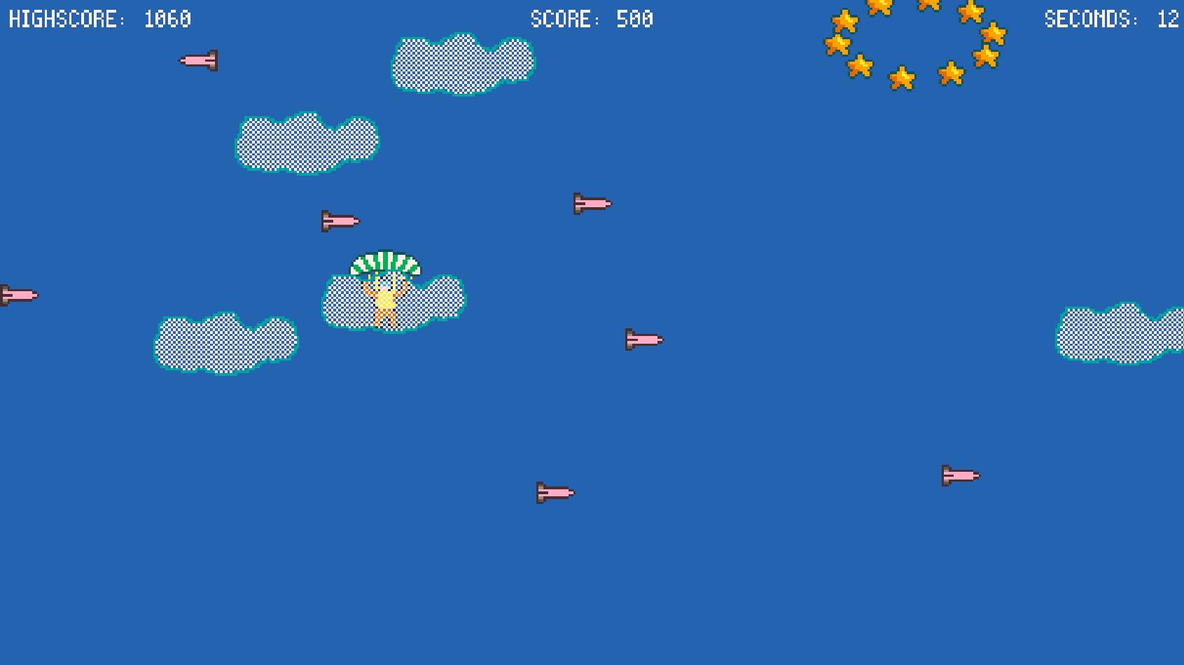
Also graphic styles like dithering have a comeback. A quick refresher on dithering: it uses small pixel patterns to fake extra colors, transparency, or gentle gradients when the color palette is limited. Dithering works better on old CRT displays, but the effect can also look nice on modern monitor, when used correctly. I used this effect in my first Picotron game "Super Realistic Parachute Simulator" to simulate transparent clouds.
My conclusion for developers: intentionally constrained styles are not just about nostalgia. They ensure clear readability, keep the scope under control, and let small teams or solo developers ship faster and with more precision. If you need a solid set of production rules this approach is a strong choice with light asset load and strong visual identity.


